
Sinjang Design

Kain Tabur Putih
The Kain Tabur Putih design beautifully captures the essence of Brunei's heritage, with its scattered white floral and diamond patterns set against a deep, rich background. The name, meaning "scattered white cloth," reflects the understated elegance found in Brunei’s traditional weaving. Each element seems to tell a story of communities intertwined, much like the villages of Kampung Ayer, where life flourishes in harmony.
The diamond shapes at the center of the pattern represent the hidden treasures of Kampung Ayer, symbolizing the people who live there—quietly strong and invaluable, like "gems in plain sight." The surrounding floral details soften the design, evoking a sense of growth and continuity, much like the enduring traditions of Brunei.
Along the edges, the sharp triangular shapes bring to mind the iconic wooden bridges connecting the stilt houses in Kampung Ayer. They remind us of the delicate balance between tradition and progress, as these bridges have been used for generations, tying the past to the present. Kain Tabur Putih is more than just a design—it's a reflection of Brunei's timeless culture, resilience, and sense of community.

Kain Kampung Aying
This design is inspired by the heritage site of Brunei, Kampung Ayer, and symbolizes the rich cultural blend of the community. The "Cina Berputar" motif embodies the unity of people from diverse backgrounds, while also representing the different kampungs within the area.
The wooden bridges connecting the Cina Berputar highlight the enduring use of traditional pathways that have been a lifeline for Kampung Ayer's residents, from the past to the present. The smaller flower between the bridges and the Cina Berputar symbolizes the alternative modes of transportation available in the area, aside from the iconic RIPAS Bridge.
At the heart of the design, the diamond within the Cina Berputar and flower symbolizes the historical figures and the everyday residents of Kampung Ayer. It reflects the idea that they are "diamonds in plain sight," valuable yet often overlooked. Finally, the upper and lower edges ("tepi atas" and "tepi bawah") represent the land surrounding Kampung Ayer, framing the essence of this iconic area.
.png)
Kain Silubang Bangsi
The Bruneian woven Kain Tenunan Silubang Bangsi (Daerah-daerah Brunei) is a traditional Malay textile design unique to Brunei, celebrating the Silubang Bangsi motif across the nation’s four districts. Created specifically for the Brunei Student Council in Malaysia, this collection of designs pays homage to Brunei’s cultural heritage while incorporating modern touches that resonate with today’s generation of Bruneian students abroad.
Each poster draws deep inspiration from Brunei’s guiding national philosophy, Melayu Islam Beraja (MIB) which emphasizes Malay identity, Islamic values, and the monarchy. The designs also represent the individual characteristics of Brunei's four districts: Brunei-Muara, symbolized by the High Council; Temburong, reflecting the role of Religious Affairs; Tutong, highlighting Public Relations and Welfare; and Belait, representing student Activities. These elements showcase the diversity and unity within the Bruneian community.
The two-star colours within the posters hold special significance, representing the two key regions of Brunei. This detail emphasizes the country’s dual identity—both traditional and progressive. By incorporating these colours and motifs, the designs not only honour Brunei’s long-standing customs but also bridge the gap between tradition and contemporary life, especially for Bruneians studying and living in Malaysia.
Overall, the Kain Tenunan Silubang Bangsi (Daerah-daerah Brunei) serves as a cultural symbol of Brunei’s rich heritage, promoting a sense of pride among Bruneians and fostering connections between the homeland and its citizens abroad. It stands as a testament to how deeply rooted traditions can inspire and inform modern design, representing the nation’s unity, cultural richness, and collective identity.
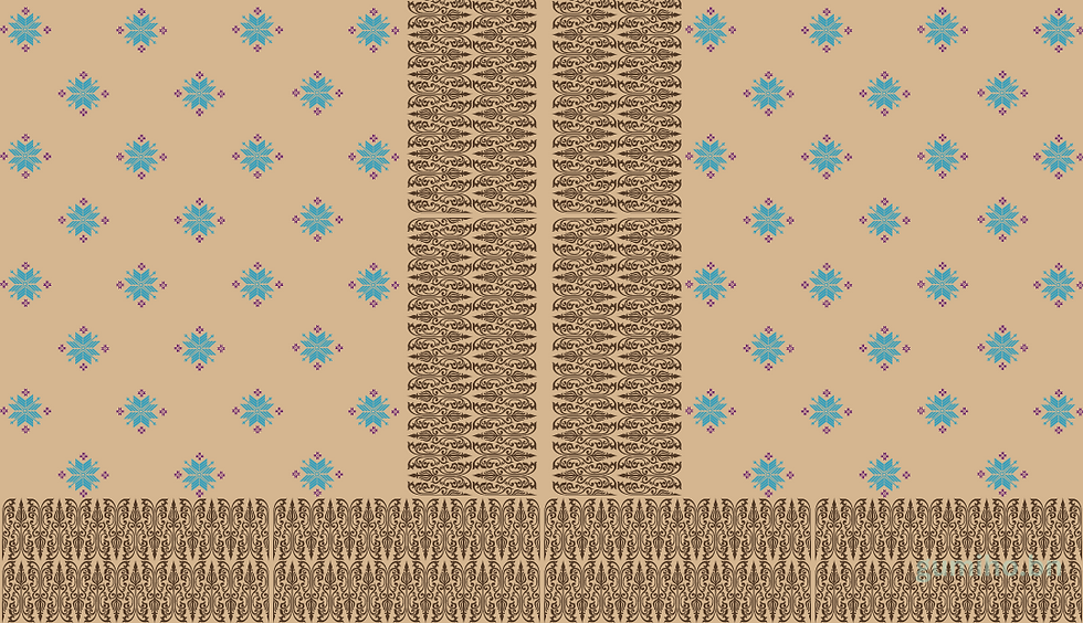
Kain Royal Brunei Airlines
This design draws inspiration from the iconic uniform of the Royal Brunei Airlines stewardesses, celebrating the elegance and grace associated with Brunei’s national airline. The pattern evokes the charm and poise of Brunei’s hospitality, as reflected in the stewardesses' attire, which symbolizes professionalism, tradition, and a deep sense of cultural pride.
The soft beige background represents a sense of calm and serenity, much like the warm welcome passengers receive aboard the flights. The vibrant blue floral motifs scattered across the design reflect Brunei’s natural beauty, drawing on the country's lush landscapes and serene environment. These floral elements also embody the spirit of care and attention to detail that the stewardesses offer, ensuring comfort and service to all passengers.
The intricate brown patterns running vertically and along the edges pay homage to traditional Bruneian textiles, specifically referencing the songket weaving that holds historical significance. These details not only add a touch of Bruneian tradition but also represent the modernity and sophistication of the airline.
Overall, this design captures the essence of the Royal Brunei Airlines uniform, fusing modern elegance with cultural heritage, much like the role the airline plays as a bridge between Brunei’s traditions and the wider world.